Sans Serif City: The Quiet Death of the Weird Beer Label
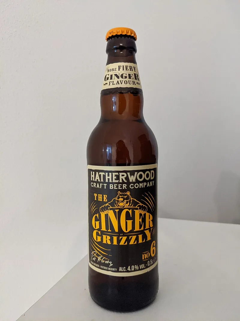
Photo: Pansebert, CC0, via Wikimedia Commons
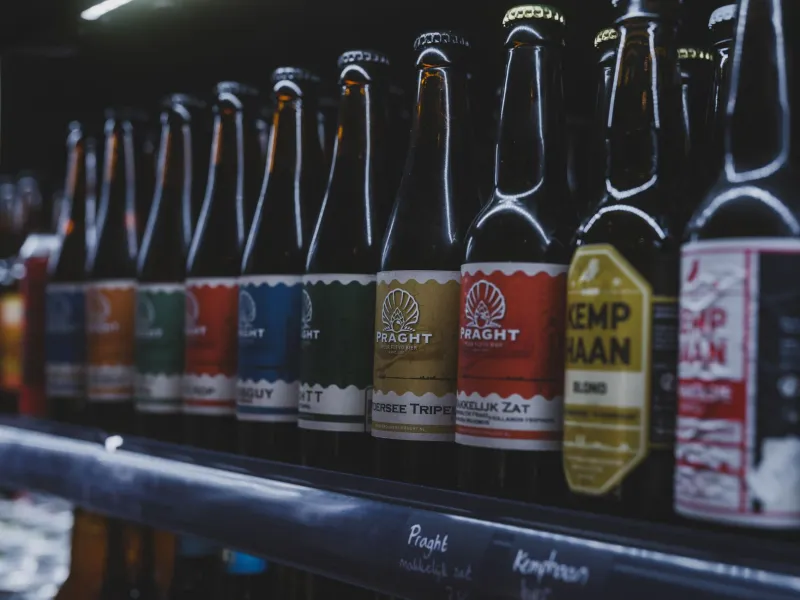
Walk down the cooler aisle of any decent bottle shop in Austin, Portland, or Brooklyn and squint a little. Past the haze, you'll notice something odd: the cans all look like they were designed by the same person. Same soft pastel gradients. Same chunky, friendly sans serif. Same little geometric sun or abstract wave sitting dead center like a corporate meditation app logo.
It wasn't supposed to be this way. Craft beer built its identity on being the loud one in the room — the label that looked like a metal album cover or a tattooed carnival poster while the macro lagers played it safe. Now the rebellion has a style guide.
From Flyer Stapled to a Light Pole
Ask anyone who's been in the game long enough and they'll tell you the shift happened fast. Ten years ago, a brewery label was basically a gig poster you could drink. Hand-lettered type, three-color screen print energy, a mascot with too many teeth. It came from the same visual gene pool as the flyers stapled to light poles outside the venue — because a lot of the same designers were doing both.
"I got my start drawing show flyers for $50 and a case of beer," says a Portland-based illustrator who's designed for a dozen Northwest breweries. "The breweries knew exactly what they were buying. They wanted their IPA to look like the show happening down the street."
That crossover made sense culturally. Beer and live music shared venues, shared audiences, shared aesthetics. The lager label became a band poster because, functionally, it was one — a 12-ounce advertisement for a subculture.
The Shelfie Economy Changes Everything
Then Instagram happened to all of us.
Designers will point to a specific inflection point: when breweries started realizing their cans weren't just packaging, they were content. A photogenic can in a well-lit shot at a rooftop bar was free marketing. Suddenly the brief changed from "make it look like a Danzig poster" to "make it pop in a 400-pixel grid."
Minimalism won that fight on pure physics. Busy illustrations turn to mush at thumbnail size. A clean gradient and a bold wordmark read instantly, even on a cracked phone screen at 11 PM. Add in shelf competition — where a can has roughly a quarter-second to catch a browser's eye next to forty competitors — and the math becomes brutal. Every design studio arrived at the same solution, so every can started looking like every other can.
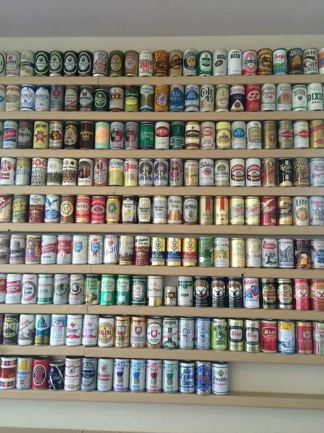
The collectors noticed immediately. The most hyped can drops now trade like concert merch — limited runs hyped on release day, flipped online within hours, hounded by the same crowd that camps out for festival posters. Except the merch-ification pushed design even further toward the safe and the drop-friendly. Weird doesn't scale. Weird doesn't sell out in 20 minutes.
The Designers Who Hung Up on the Trend
Which is exactly why a small crew of label designers is deliberately swimming against the current. Their toolkit looks almost confrontational in 2025: regional typography references, hand-pulled textures, color palettes pulled from vintage produce crates and old roadside signage.
One designer in Asheville described her studio's philosophy as "designing for the person holding the can, not the person scrolling past it." Her labels lean on lettering styles pulled from Southern matchbooks and motel marquees — stuff that means something within fifty miles of where it's sold and looks charmingly alien everywhere else.
The gamble is that specificity is the new scarcity. When every shelf is a wall of tasteful minimalism, a label that looks like it came off a 1962 grain sack stops being dated and starts being distinctive. Breweries working with these holdouts report something interesting: their cans get photographed more, not less, precisely because they look nothing like the algorithm-approved norm.
What the Label Owes the Music
There's a full-circle irony here that the beer-and-music world should appreciate. Craft beer borrowed its visual language from gig posters, then sanded it down for the feed, and now the most interesting designers are finding their way back by digging through the same analog archives — ticket stubs, record sleeves, hand-painted signs — that inspired the original wave.
The lesson the holdouts keep repeating: a label, like a song, works when it sounds like it could only have come from one place. The homogenized can is a cover version of a cover version. The weird one is the demo tape.
So next time you're staring into the cooler, look past the pastel wall. Somewhere in the back, there's a can with a hand-drawn monster on it, made by someone who used to draw flyers for a $50 door split. Buy that one. It's the closest thing to a limited press the shelf has left.